PaletteScry
A color palette tool that previews choices in realistic UI layouts.
The Project
While growing from a technical background into design, one recurring challenge was choosing palettes confidently.
Swatches looked fine in isolation, but often changed once applied in full interfaces.
I created PaletteScry, a palette picker that applies selected colors to example interface layouts so designers can evaluate palettes in context.
I ran research, design, and development end to end and shipped a functioning Webflow implementation.
Research
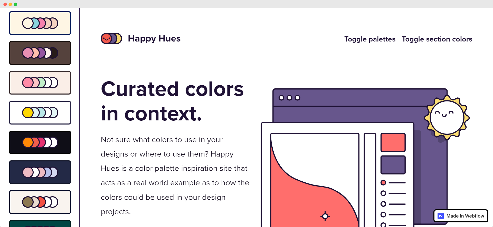
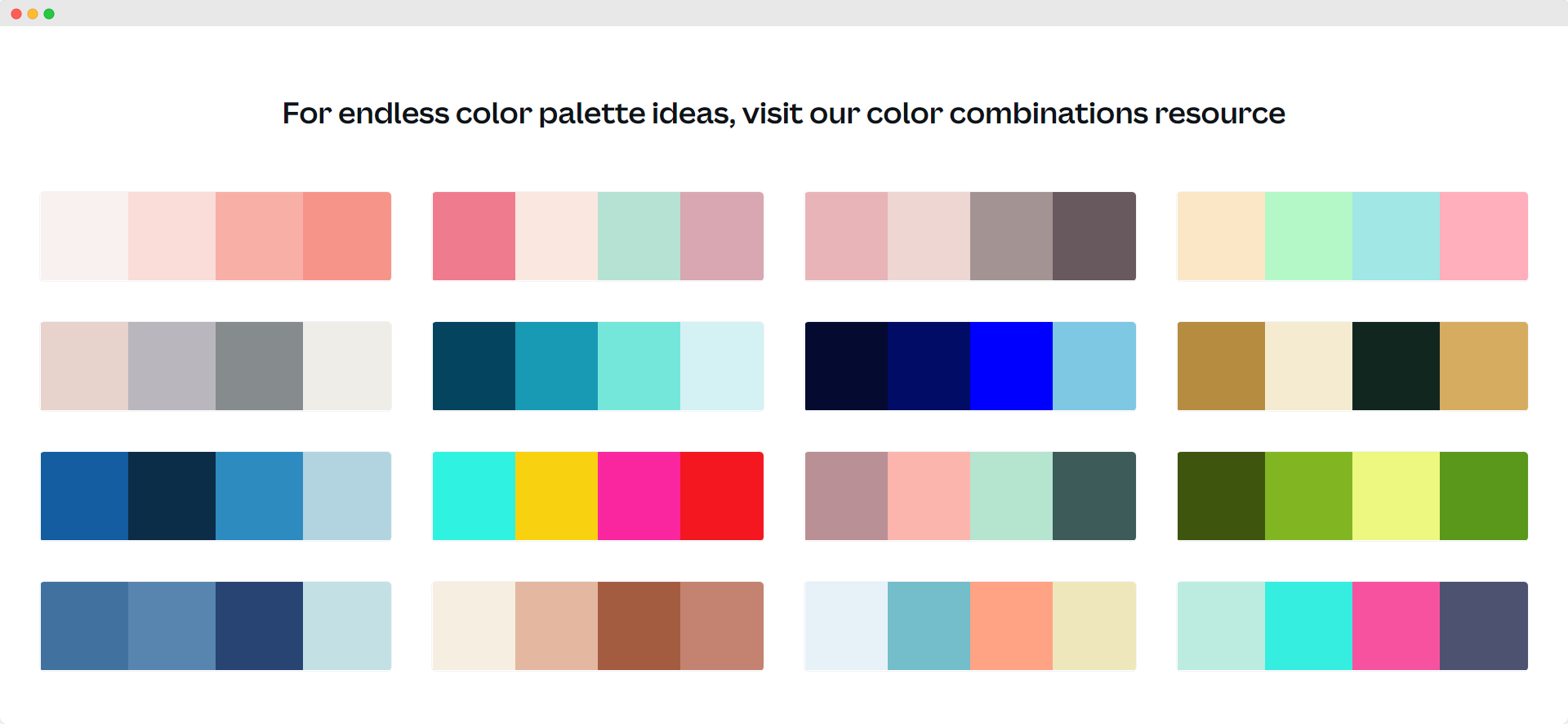
I conducted competitor analysis amongst a number of online color palette picker tools - some examples follow:
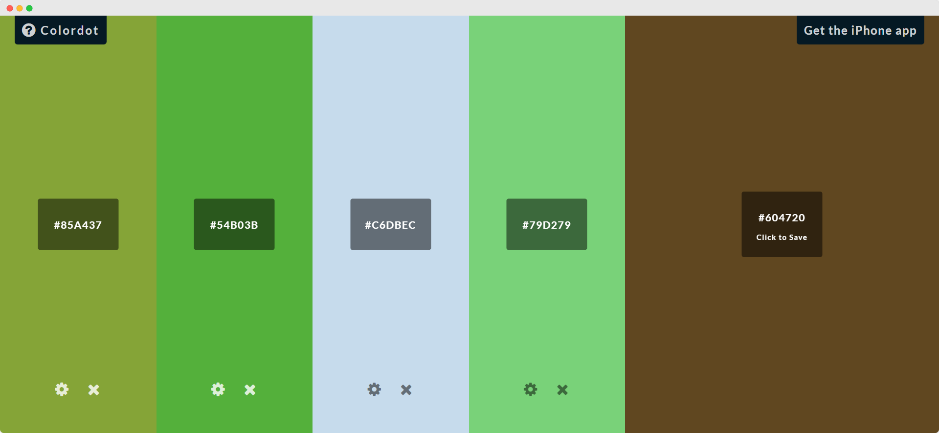
As standard, most of them offer the following:
- Palettes consisting of at least several color swatches for comparison.
- An easy way of creating palettes or altering existing saved ones, usually through simple color pickers or hexadecimal entry.
- A way to save, download, or copy created or altered palettes.
However, hardly any of them allowed the user to actually view how the chosen palettes would look in an interface layout - either the palettes were simply swatches laid in a line across the screen, or the interface of the palette picker itself would get re-colored for the chosen palette.
Canva contained something close, in that it does offer colorable templates. However, using that takes several clicks, a login/signup, and extra customization.
I believe the PaletteScry application could provide value in letting designers see what their color schemes would look like on a generalized landing page or content page.
Defining the Design
Based on my research, I decided PaletteScry should offer much of the same functionality for creating, comparing, and saving color themes that are found in other online color pickers, in addition to its own unique layout functionality.
I drew up a user flow map showing how users might complete the task of finding and saving a palette. Click for larger image:
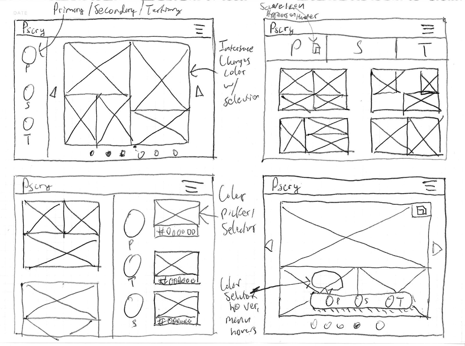
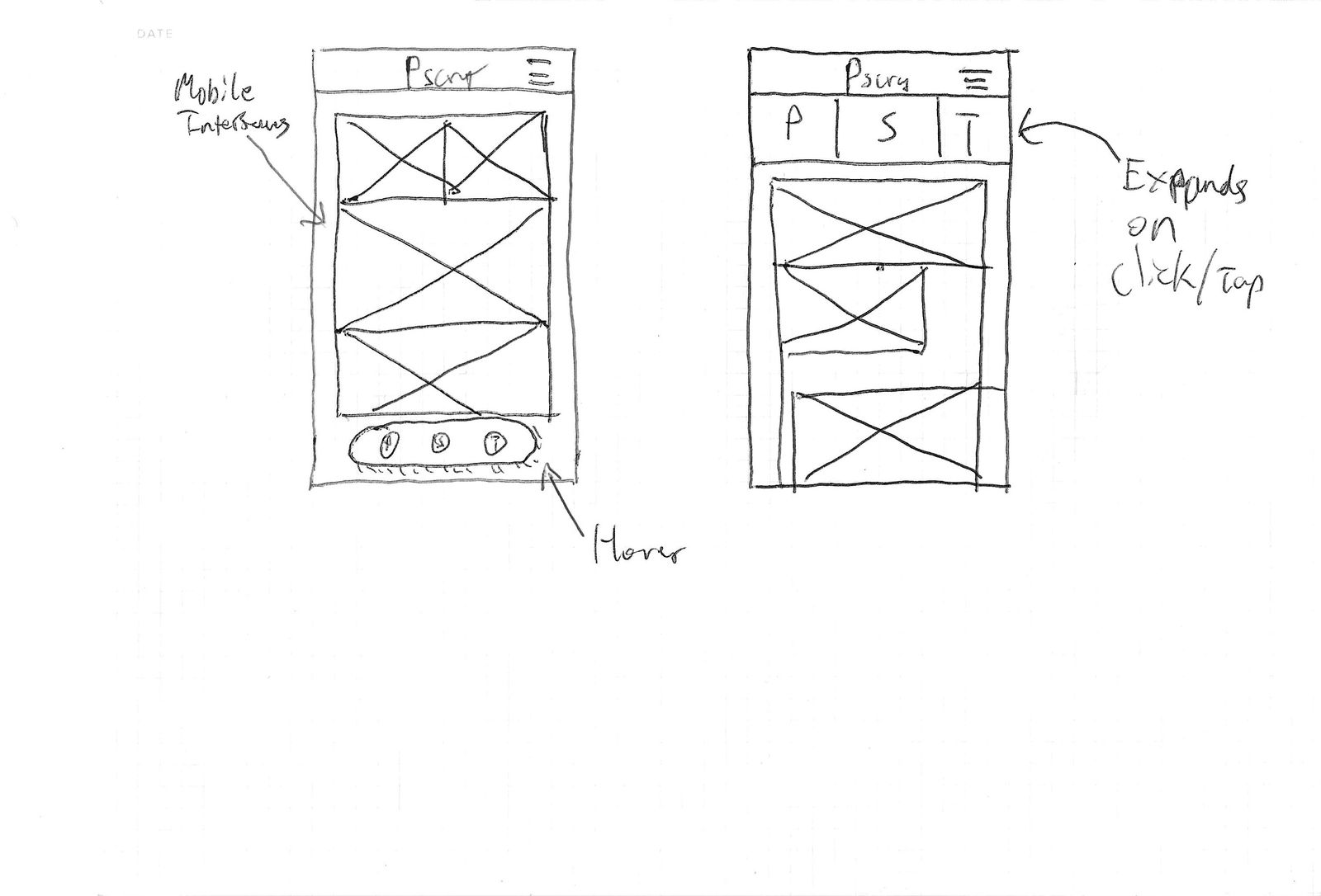
First Sketches
I sketched some ideas for the layout in both desktop and mobile versions:
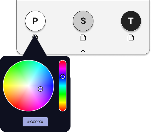
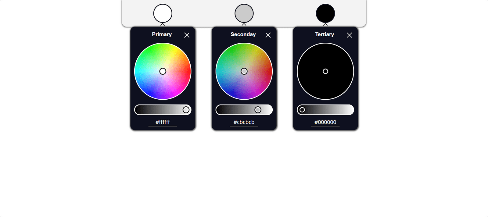
Designing the Palette Picker
I designed the interface that would actually allow users to change and update the colors on screen.
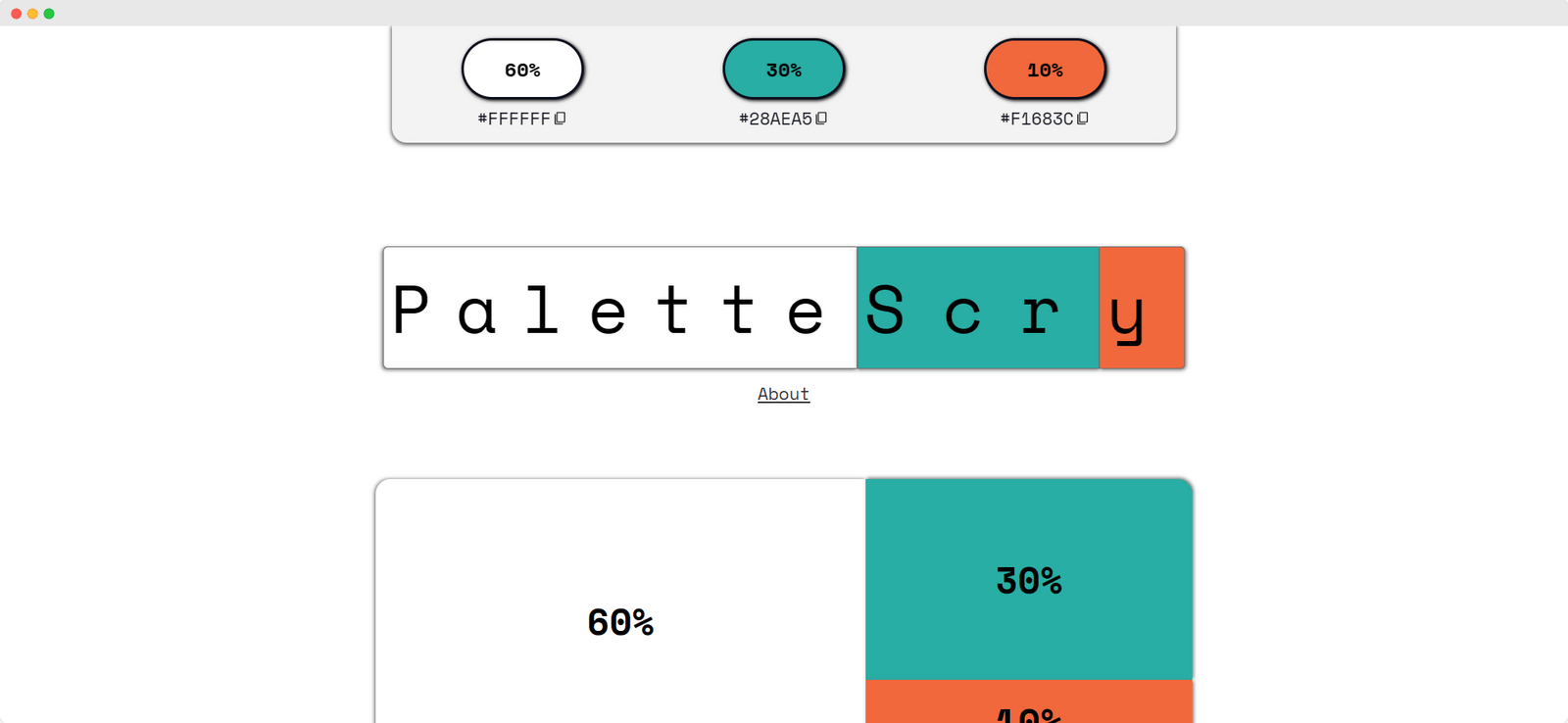
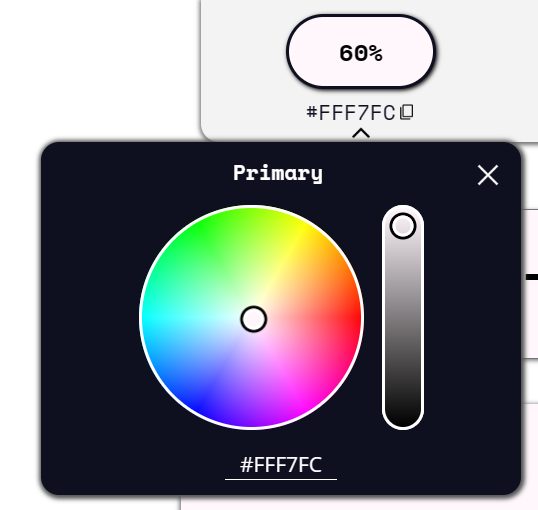
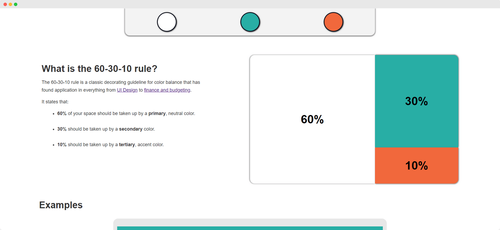
I decided to design it around the 60-30-10 rule, a useful and time-honored guideline for creating a balanced color scheme.
Following the rule, the picker would allow users to choose a primary, secondary, and tertiary color to make up their color palettes.
Images of initial, subsequent, and final designs follow. I used iro.js for the color picker functionality.
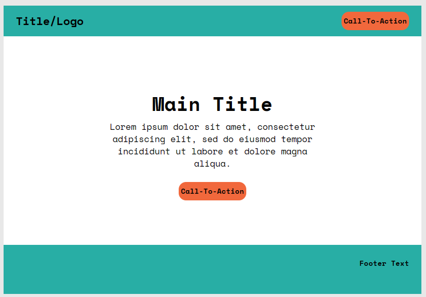
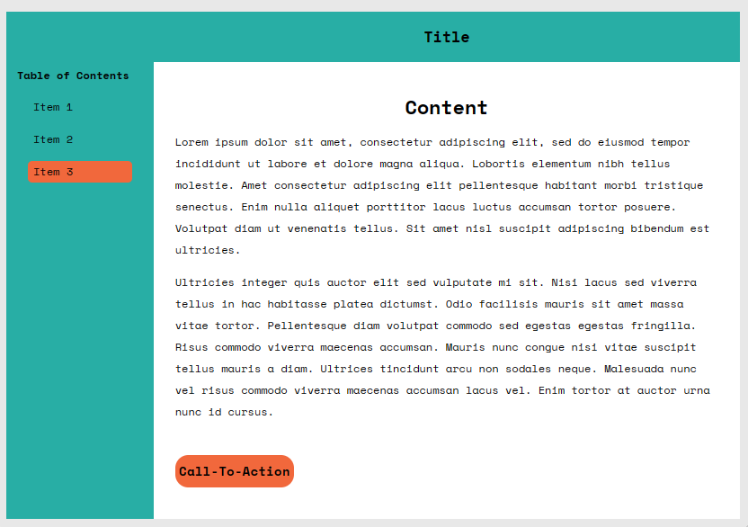
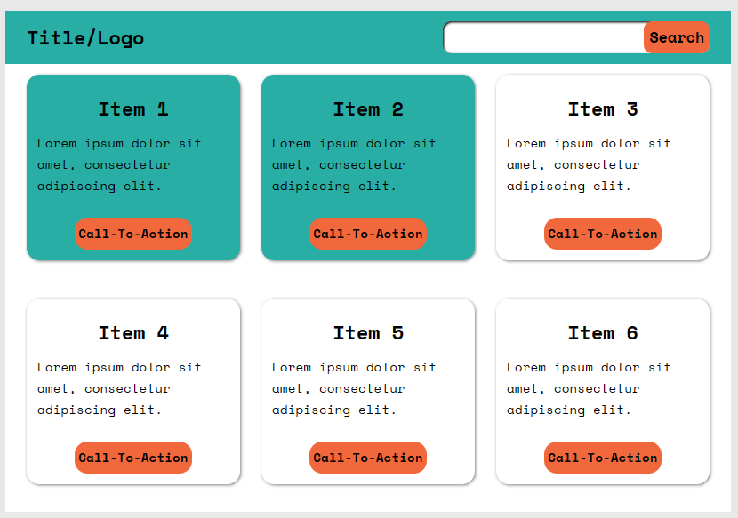
The Layout Examples
I chose three example layouts which would give users a better idea of what their color choices would look like on a real interface.
The examples represent simplified versions of common website and application layouts. The sections in each example are colored to closely follow the 60-30-10 rule of the primary, secondary, and tertiary color sections.
First Prototype Designs
I created my design prototypes as fully functioning Webflow sites, to achieve a more fully testable prototype.
I went through several iterations on the design while in the process of creation, aiming for higher usability and responsiveness.
Notes:
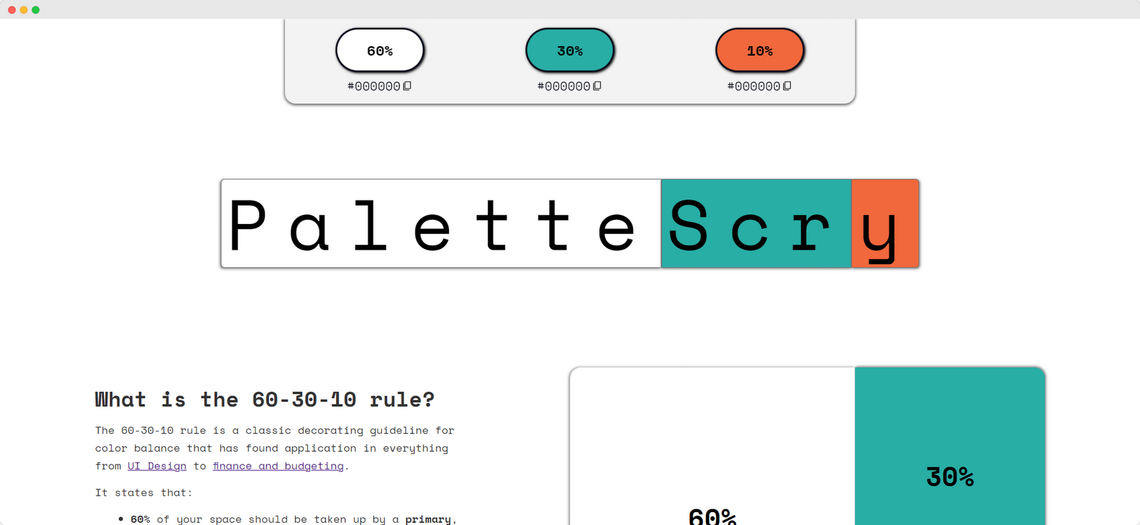
- Initial description of the 60-30-10 rule and color percentage example included for context, and example layouts placed below it.
- Color pickers also have functionality for copying the chosen colors to the clipboard.
- Colors in the percentage example, the logo, and the layout examples all change depending on the color choices the user makes, and can be clicked on to open their respective color pickers.
Usability Testing
Usability testing was conducted on the prototype to answer the following questions:
- How easy and intuitive is the interface to pick up and use?
- How useful is this color picker concept, and how useful are the example layouts?
Test participants were designers themselves, a number of whom were taking the same DesignLab course that I had.
Test methodology was as follows:
- Start the participant on the prototype, and briefly explain the intent.
- Ask the participant to put themselves in the shoes of a designer asked to choose a general palette/theme for a new project, and give prompting words like "warm, approachable, calming" or "exciting, modern, energetic".
- Set a timer, and ask the participant to use the prototype to try to come up with a color palette that fits the prompting words.
- Once time is up, or the participant is happy with their choice, ask how easy it was to use, how useful it felt, and any pain points or suggestions.
There are no right or wrong answers for the final color palettes; the idea was simply to have participants interact with the prototype in a typical use case.
Usability Testing Results
I created an affinity map summarizing the results of the test:
Notes:
- Highly positive feedback on both interface ease-of-use and usefulness - several participants noted it solved an issue they themselves were having in the course of their work.
- Some feedback in regards to the layout of the page - several participants did not immediately notice the example layouts at the bottom, and several others did not immediately notice they could click the layouts to open up the pickers.
- Some common suggestions for improvement included functionality to suggest complementary colors or accessible color combinations.
Iterated Designs
Link to PaletteScry website, showing iterated designs.
Notes:
- Layout updated to be more scrolling friendly, more mobile friendly, and to highlight and eventually draw the eye down to the example layouts.
- Functionality to open color picker made more obvious.
Next Steps
As mentioned, a common suggestion during usability testing was adding functionality to suggest complementary color schemes based on the color choices. This would be an obvious next step, and would likely be a separate sub-project to work out how best the functionality can be added.
I was happy to see most people found the example layouts to be useful, and I am considering adding more examples to represent more kinds of layouts in the future.